So… What Is the Golden Ratio?
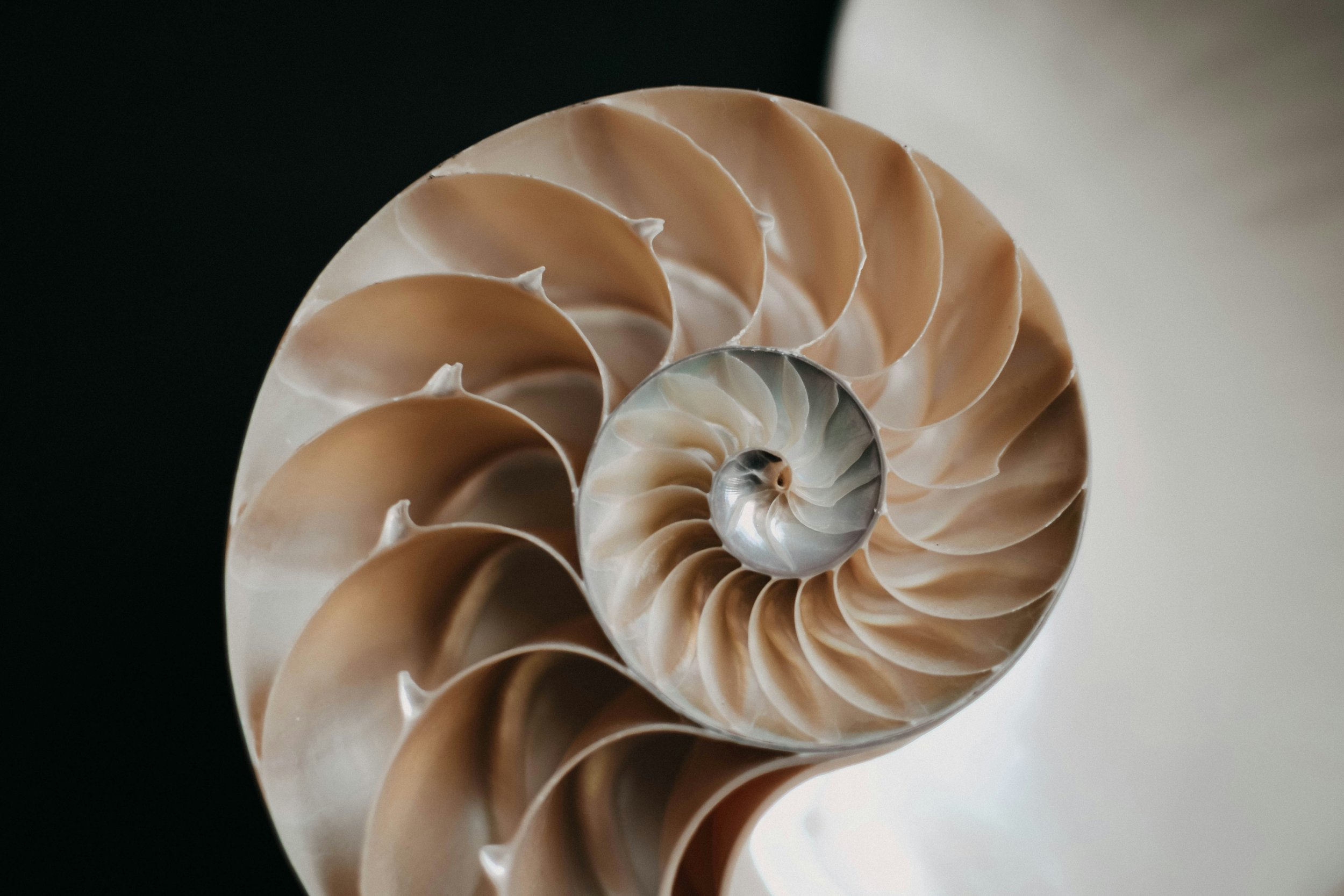
Have you ever looked at something and thought, this just feels right without knowing why? That feeling often comes from the Golden Ratio, a ratio between two numbers that equals approximately 1.618. The ratio is a mathematical relationship found throughout nature, art, and design—from seashells, to the Mona Lisa, to the Twitter logo.
In art, design, music, and nature, this ratio shows up again and again, quietly shaping what our brains perceive as balanced and beautiful.
What is the Fibonacci Sequence and how does it relate to the Golden Ratio?
The Fibonacci sequence is a simple pattern where each number is the sum of the two numbers before it (1, 1, 2, 3, 5, 8, 13…). On its own, it looks like basic math, but this sequence shows up everywhere in nature: the way petals form on flowers, how shells spiral, even how branches grow on trees. When you translate this sequence into proportions, you get the Golden Ratio—a naturally pleasing balance our brains tend to recognize as “right.” In design, it gives us a quiet, intuitive blueprint for harmony.
Think of a line that you split into two parts: one longer, one shorter. The Golden Ratio happens when the relationship between those two parts stays consistent no matter how you compare them. In other words, the long part relates to the short part the same way the whole line relates to the long part.
That shared proportion is the “golden” part. Our brains love patterns that repeat cleanly. When the part-to-part relationship matches the part-to-whole relationship, everything feels cohesive and intentional instead of random. It creates balance without symmetry and structure without stiffness.
How does the Golden Ratio apply to design?
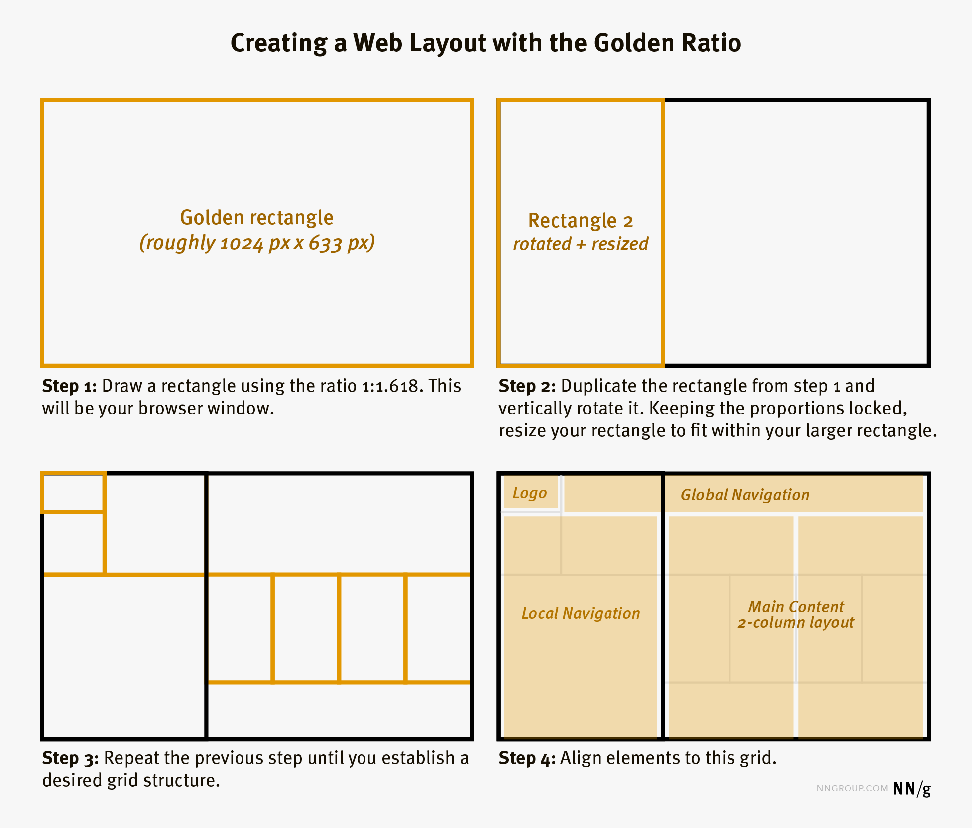
Design is really about guiding the eye, and the Golden Ratio creates a natural visual flow. When layouts, spacing, or proportions follow this rhythm, our brains process them more easily. Nothing feels cramped or awkward; instead, elements relate to each other in a way that feels intentional and calm. Designers often use it (sometimes without even realizing it) to create hierarchy, balance, and harmony in logos, websites, typography, and illustrations.
Below is an example of how I used a series of 1:1.618 incrementally sized circles to perfect a logo for one of our Denver-based Brand Identity clients, ShayrdAir.
ShayrdAir Logo by Human Nature Studios - perfected using the Golden Ratio
The Golden Ratio is why a layout with one dominant area and one supporting area often feels better than splitting everything evenly. One leads, one supports, and together, they feel complete.
Copyright © 1998-2026 Nielsen Norman Group
How can you actually use this in your daily work?
For designers, when you’re stuck choosing sizes, spacing, or emphasis, use it as a gentle guide. Designing a website or Instagram graphic? Let one element lead (about 60%) and the rest support it (about 40%).
Try scaling elements using rough Fibonacci steps rather than jumping randomly between sizes. Not sure what size your healine should be compared to copy text? Try using a 1:1.618 ratio. The same idea applies to white space: if something feels crowded, use the ratio to determine breathing room for elements in a layout.
The Golden Ratio isn’t a rulebook—it’s a shortcut to balance. When things feel “off,” it gives you a simple, natural way to recalibrate and move forward with confidence.
When not to use the Golden Ratio
The Golden Ratio isn’t a magic formula, and it’s not something you need to force into every project. If a layout already feels clear, expressive, and aligned with your brand personality, that matters more than hitting a perfect mathematical proportion. Think of the Golden Ratio as a guide you reach for when something feels off—not a rule you must follow. Good design balances logic with intuition, not one over the other.
Why does this matter for your brand?
When your visuals feel naturally balanced, people trust them more, even if they can’t explain why. The Golden Ratio isn’t about rigid rules; it’s about borrowing nature’s blueprint to create work that feels intuitive, human, and quietly confident.
At Human Nature Studios, we use principles like the Golden Ratio not as rigid rules, but as tools to create brands that feel intentional, human, and easy to trust. Whether you’re building a new brand identity, refining your logo, or designing a website that actually converts, thoughtful proportion plays a bigger role than most people realize. If you’re curious how this applies to your own brand, explore our brand identity and design services, or keep learning more in our brand strategy journal, where we break down design concepts in a way that actually makes sense for real business owners.


