The Conservation Alliance
CHALLENGE
TCA’s Brands for Public Lands program needed a shared membership mark that could work for a wide range of outdoor brands—not just mountain-focused ones—while still feeling distinct from The Conservation Alliance’s main logo. It had to feel unified, but with the ability to be used across outdoor industries including fishing, hunting, water sport, mountains, and more.
SOLUTION
I designed a modular logo lockup system with multiple formats and interchangeable icons, so brands could choose imagery that matched their outdoor focus while keeping a consistent coalition look. The system is simple, flexible, and works across digital, print, and packaging, while visually aligning with The Conservation Alliance brand (and not competing with it).
OUTCOME
The final lockups give member brands an easy, credible way to show their support for public lands and to promote their membership. The system feels inclusive, recognizable, and lets each brand participate in a way that still feels true to them.


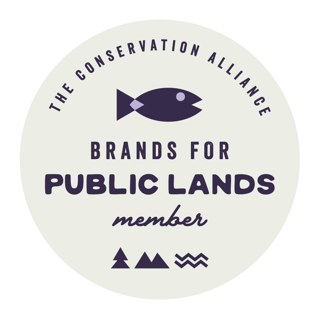
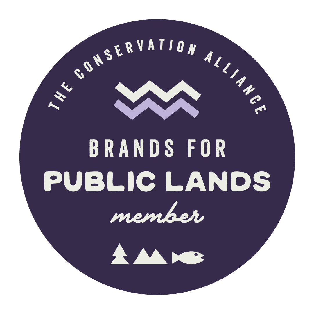
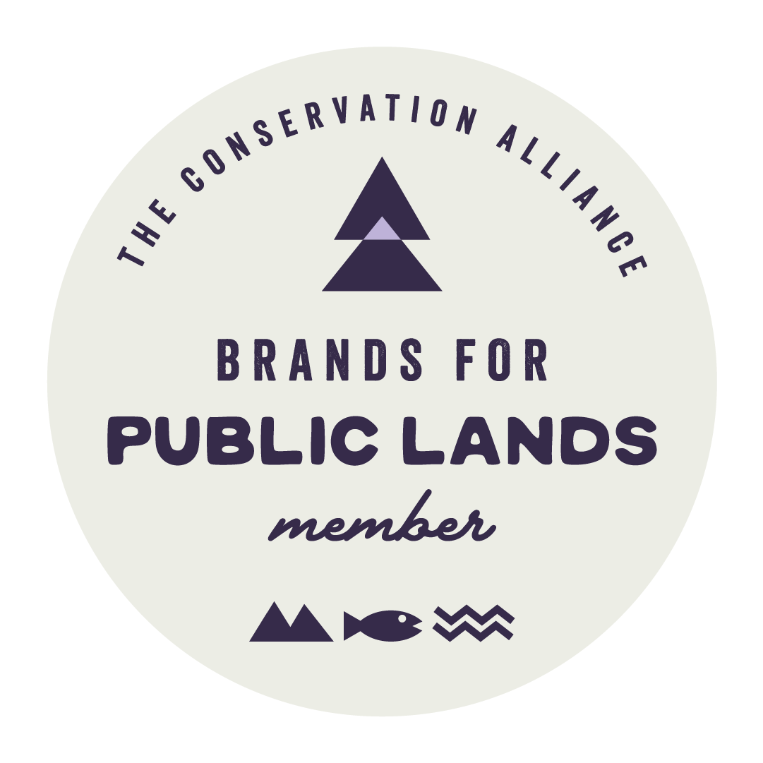
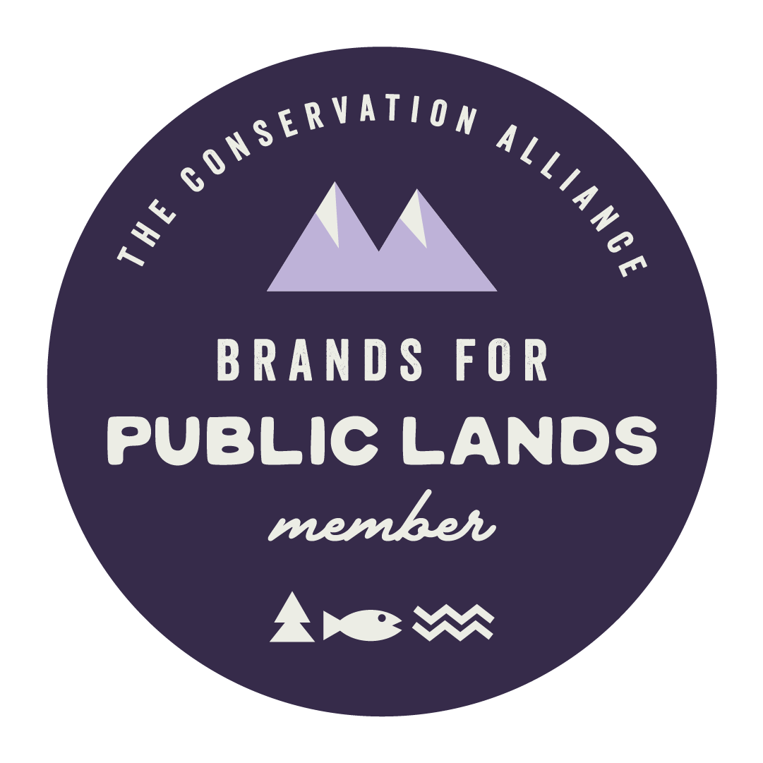
The icon system features a fish, mountain, tree, and wave—each illustrated in a cohesive, consistent style to ensure visual unity, while allowing brands across fishing, mountain, forest, and coastal outdoor categories to authentically represent their specific connection to public lands.
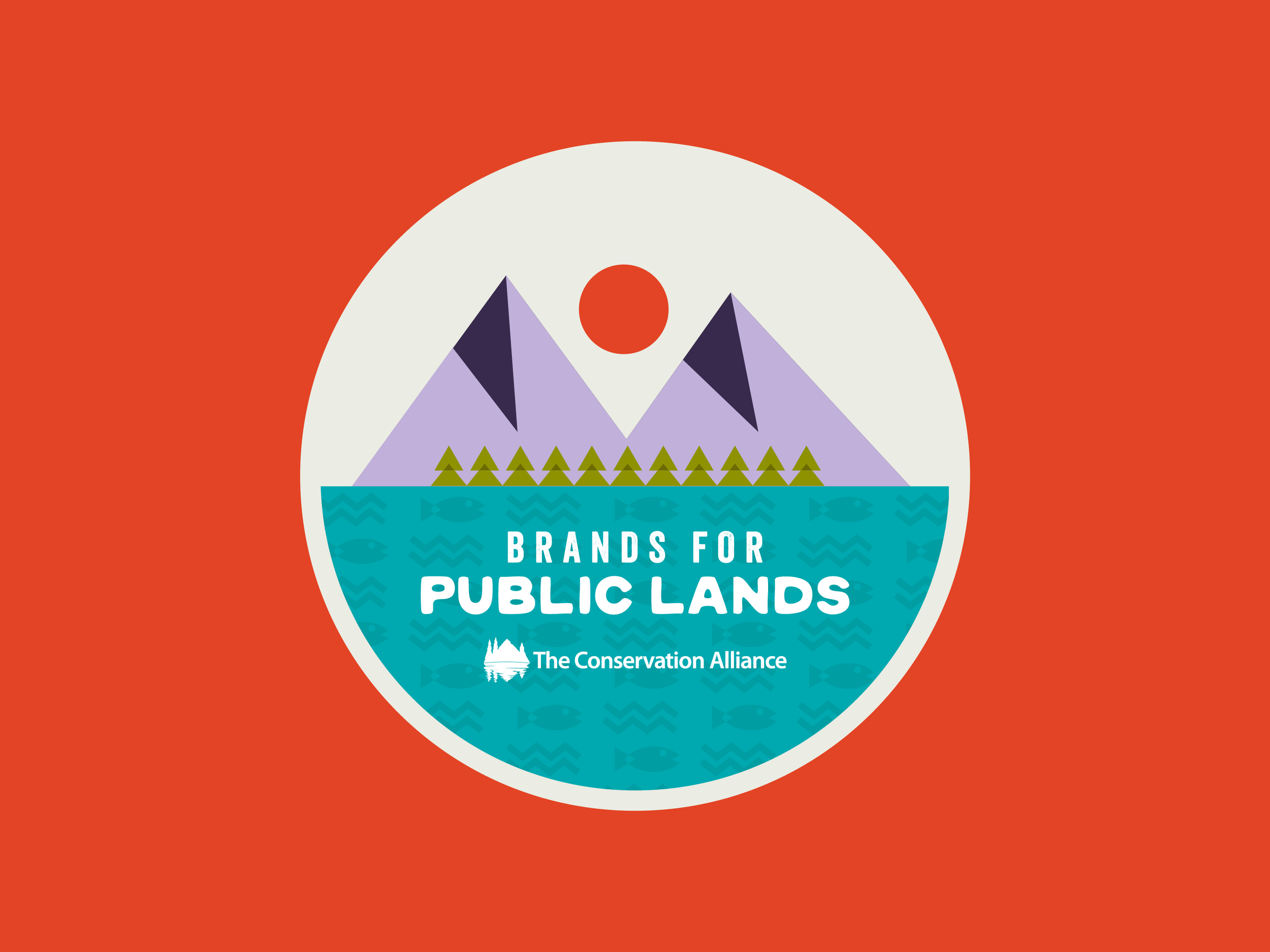
I brought the entire system together by translating each icon into illustrative imagery, integrating the full TCA color palette, and unifying the TCA and Brands for Public Lands marks into a single, cohesive sticker design that feels intentional, authentic, and fun.
The final lockups and sticker are designed for member websites, giving brands a clear, credible way to show their involvement in Brands for Public Lands. The flexible, easy-to-use system scales with the coalition while fitting naturally into TCA’s existing brand identity.